Devlog v0.13 - Ride of the Time Bed 2???
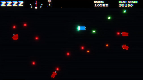
DevLog v0.13 - Ride of the Time Bed 2
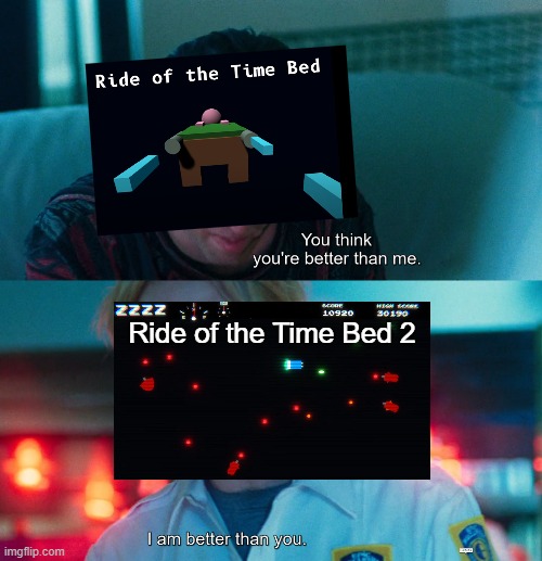
(We're going to ignore the lack of a main menu. Or a volume slider. Or a tutorial. Or a bunch of other stuff)
(No but seriously, the gameplay and visuals are SO MUCH BETTER already!)
Introduction
So, mostly on impulse, the idea of making a game pack themed around a virtual arcade was born. But although the idea of the virtual arcade functioning as a main menu/game select screen is neat, a game pack is nothing without games, and I didn't really have any sort of ideas for those.
Then I remembered Ride of the Time Bed, a little bullet-hell game I made about 2.5 years ago when the first-years of my school organized a 48-hour game jam and I decided to participate. Its simple arcade-style gameplay mechanics, the short playtime, and its relative scalability made a potential sequel/remake a good fit for the game pack!
With the idea of a Time Bed sequel in my head, I considered making a prototype version of the Arcade/menu first, but after some browsing in the Unity Asset store and general procrastinating, I decided to start working on the first game first. Partially because in my head having a game to present makes making the Arcade easier, but mostly because I was far more motivated for this!
Identifying points of improvement
So before I could start working on the game, I had to figure out what I actually wanted to make. Considering I was going for a sequel/remake of one of my earlier games, I dug up the build for it, and played it a couple of times. My goal was identifying what to keep, what to improve, and what to add.
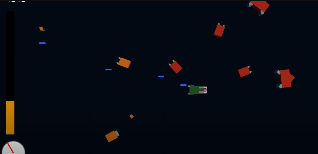
I quickly decided I was going to keep the controls and mechanics relatively intact, but a lot of the gameplay definitely invited improvement. The difficulty curve of the first game is basically a flat line followed by a near-vertical cliff, and although it has some sort of wave spawning, it doesn't make this clear at all, nor does it flow that nicely. Although I really like the mechanic of using up fuel to slow down time, and then speeding up time to regain it, and I am keeping it, the gameplay of the first one never really allowed for the second half of that mechanic, as there was no moments of rest or calmness. Looking back, I also wasn't too fond of the game speeding up when you ran out of fuel. Not being able to slow down time should be a problem on its own.
Another area of improvement was visuals and UI. Although cubes and spheres have kind of been my style, I've recently been learning a bunch of basic stuff about the art side of Unity (post-processing makes anything look better with minimal effort!) and I can definitely do a little better now.
The tutorial of the game will also need a work-up from a big information-overload screen of text, but at this point I haven't gotten to that yet. Currently the plan is to keep explanation to the absolute minimum with a tiny interactive tutorial, and to let the player figure out the rest (or read the manual if it comes to that), but that might change based on playtest results.
I didn't even look at the old code, but considering it was a game jam game made when I knew a lot less about Unity, that's probably for the better.
Visuals
I found myself a little surprised when my work started with the visuals, trying to get the vibe to go for with UI and the such. This is not how I normally go about things. Anyway, I decided to go work with an orthographic/2D camera this time, grabbed some fonts, and cranked up the post-processing (bloom, lens distortion, and my beloved chromatic aberration). I found a neat little texture of CRT scanlines that the author encouraged me to download, and it looked really good when used as a film grain texture! To test stuff out I made this little mockup of UI and gameplay (yes, I actually made a visual mockup before implementing controls. I'm weirded out too)
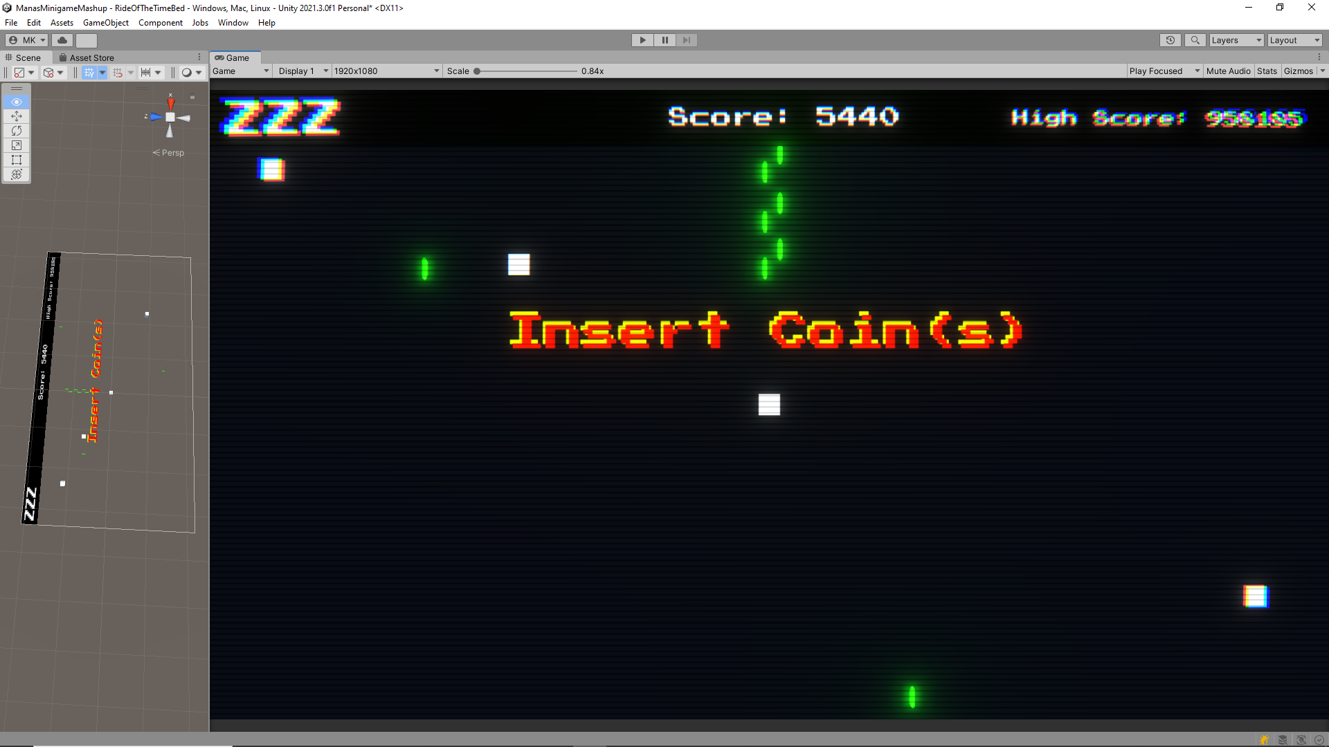
Looks pretty neat, right?
I realized that due to the orthographic camera, I could still use cubes and Unity's basic 3D shapes, and made it look like sprites. I did this, and now the player and enemies look good enough for a prototype, but if I have the time I'm probably going to replace them with sprites of some sort.
I implemented the very basic gameplay (pretty much just movement, shooting, and an enemy without behavior that could be killed), and refined the UI a little bit. Then, I had an idea for an enemy to "drop" the points they were worth when they did. I messed a round a bit, and a few minutes later, I had something like this (the screenshot is from the current version, not from what I had back then):

Sometimes, it's the little things :).
One thing I had been ignoring for a bit during development was the fuel and time UI. In the first game, fuel was just a bar that emptied and filled. It works, but it looks kinda meh. The timescale indicator was a little better, being a sort of indicator knob, but while looking at it I realized that having it be a spinning clock would be far more fun!
For the fuel, I decided to go for a fuel indicator as seen in a car. Its easy to make sense of, has the power of convention on its side, and looks good on the black background I was using for the UI. I also added the clock, with a little piece of text above it saying the timescale. Playing around with the clock and not getting the clock-spinning-very-fast effect I was going for, I decided to cheat a little, and made the spinning speed actually increase/decrease exponentially instead of linearly.
A day later, I realized the spinning clock, while looking good and conveying the idea of different time speeds adequately (I think. Playtests will provide more info on that), it had a pretty significant flaw: it no longer indicated that there were several steps of timescales! After some thinking, I decided to put the old indicator back in, but with the spinning clock thing as a second hand. Best of both worlds!
The last bit of UI work I did was the timing for the power-ups. At first I thought to just take the power-up icon, and then having it black out depending on how much time was left. I quickly realized that you can stack power-ups, which stacks the time, and that would result in a bunch of math and hacked code I didn't feel like. So I kept the same idea, but stacked 3 images on top of each other. The implementation of this is (in my opinion) quite a funny hack that I also use for health bars, involving rectTransform pivots and the magic of division.

Controls
Although I was fine with the controls I chose for the first game, I did want to improve and add some things. Adding diagonal shooting was easy enough. Gamepad support... not so much (or so I thought).
You might or might not have noticed that just about none of my games have gamepad support. This was partially because I don't own a controller that Unity recognizes as a gamepad. Luckily, that problem has been solved by me stealing borrowing a PS4 controller from a friend for a prototype (that I haven't made (yet??)), and still having that lying around. The other problem was an old enemy of mine: the Unity Input System.
Normally I just use the old Unity Input, and although I really like the idea of the new Input System, every time I've tried to implement it it's been a hassle resulting in me reverting back my project. But I didn't really have a choice, and so I made a git commit, installed the input system, followed a very good tutorial, and...
It worked perfectly first try. Huh.
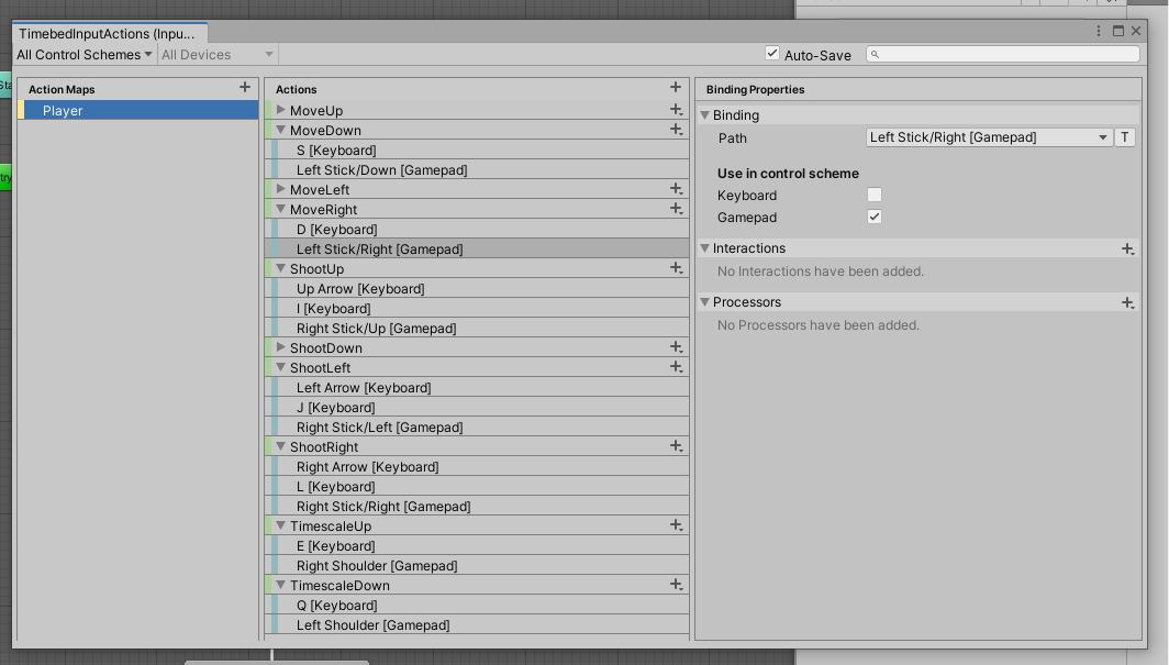
It actually does work really well (for now, I will have to rework my player controller scripts when I implement the arcade, and UI isn't working entirely just yet), so hopefully I'll be using it more often in the future (though that probably does mean actually buying a Unity-compatible controller :/)
Movement and Shooting
Movement and shooting hasn't really changed all that much from the first game. I added diagonal shooting, and I moved the spawnpoints of the lasers a bit closer together, mitigating a bit of aiming difficulty I noticed I had when playing the first game.
Power-ups
Power-ups were something I considered adding to the first game after the game jam was over, and I believe I made a start with that, but I never finished/built it. I decided to add them because they're an arcade classic, but also because they gave me an extra tool to work on the flow of the game, and reward players that were doing well, while supporting players that were struggling.
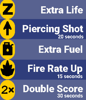
That last point deserves some elaboration. The Extra Life power-up has a higher chance of spawning when low on lives, and will never spawn if the player has 5 lives. Similarly, the Fuel power-up only spawns when below half fuel. The intended effect of this is that new players get a little breather moment when they're struggling, whereas more advanced players who aren't getting hit and managing their fuel well will get bonus score or a satisfying moment blasting enemies with piercing shots or a doubled fire rate.
A quick shoutout to pixel-art program Aseprite by the way, it made making the sprites for these a breeze, and I'll hopefully use it in the future for sprites for the player and enemies. Speaking of enemies...
Enemies
The biggest improvement on the old game, maybe apart from visuals, is enemy spawning. The old game had waves, which were defined in ScriptableObjects, but still had a lot of randomization in what waves it spawned. Taking inspiration from Devil Daggers, I wanted the waves to be the same every time, with only the spawn location randomized. This allows for more control over the flow of the game, plus it allows players to learn the patterns. Luckily, I have lately been armed with a new weapon: the Unity Animator, and AnimationEvents.
Using an Animator on the enemy spawner, and an Animation for every wave, with Animation Events to spawn enemies, timing the waves became really really easy. Every type of wave is its own animation, and using Exit Time transitions, I can decide how many times to repeat a certain wave time before going to the next one. It all makes spawning very editable and tweakable. Happy Mana noises!
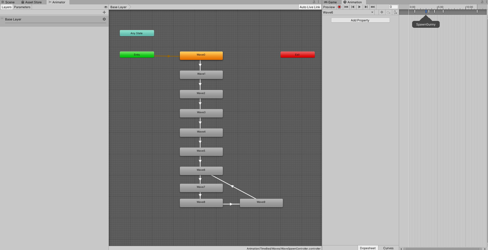
For the waves themselves, I decided to work with the following general flow:
- A single wave consisting of a single enemy, letting the player charge their fuel and get into the game
- 3-4 "general" waves, using enemies the player knows
- A special wave, introducing a new enemy type and granting a power-up on completion. These can be extra panicky, or a little easy, depending on what I want the flow of the game to do.
- Repeat this general->special process a couple of times, with the new enemy introduced in the special wave now added to the general waves, slowly increasing the difficulty
- A breather wave to allow the player to recharge their fuel
- A boss-fight, trying to ramp up the panic level
- A "reward" wave starting with many powerups and many weak enemies, giving the player a relatively safe moment of satisfaction as they mow down enemies
- Repeat (well, that's the plan. I haven't gone further than the first boss)
Playtests will determine whether this actually works, but in my opinion it definitely makes for better gameplay and flow than the original game!
Giving a power-up after the special wave allows the player to have an easier time with the first general wave or two (or get more points out of it, in case of the Double Score power-up), and then have to handle the next general waves with normal difficulty.
As for the enemies themselves, I thought the basic enemies from the original game were pretty neat, so I just re-implemented those with a few small tweaks to their behaviour. The implementation itself is different though, to allow for more modularity. A general Enemy script handles HP and taking damage. For bosses or other complex enemies, I can make subclasses of this and override stuff. Movement patterns have their own scripts, and shooting is handled through (what else) Animations. By decoupling movement, attacks, and general stuff like this, making variants of enemies becomes much easier!
The only real new addition to enemies is the Mothership, which functions as the first bossfight of the game. It randomly picks between three different patterns to use, and twice at certain HP levels she spawns a fuel power-up, only to then launch a metric ton of homing missiles at the player. The boss also spawns a double score pickup when spawning in. Initially, the idea was for this to be an incentive to beat the boss within 30 seconds. I haven't come close to it yet, but I'm sure there's some way to cheese it. I hope that playtests will agree with my opinion that the bossfight is difficulty, but doable. We'll see.
Highscores
The first game had a local high-score system, and I definitely wanted to keep that in. However, I've improved on its presentation, and added a second high-score list that lists the highest scores in the last 24 hours. That list also doesn't delete everything after the first five scores (instead keeping itself small by pruning everything older than 24 hours), allowing the player to see their ranking for today, like this
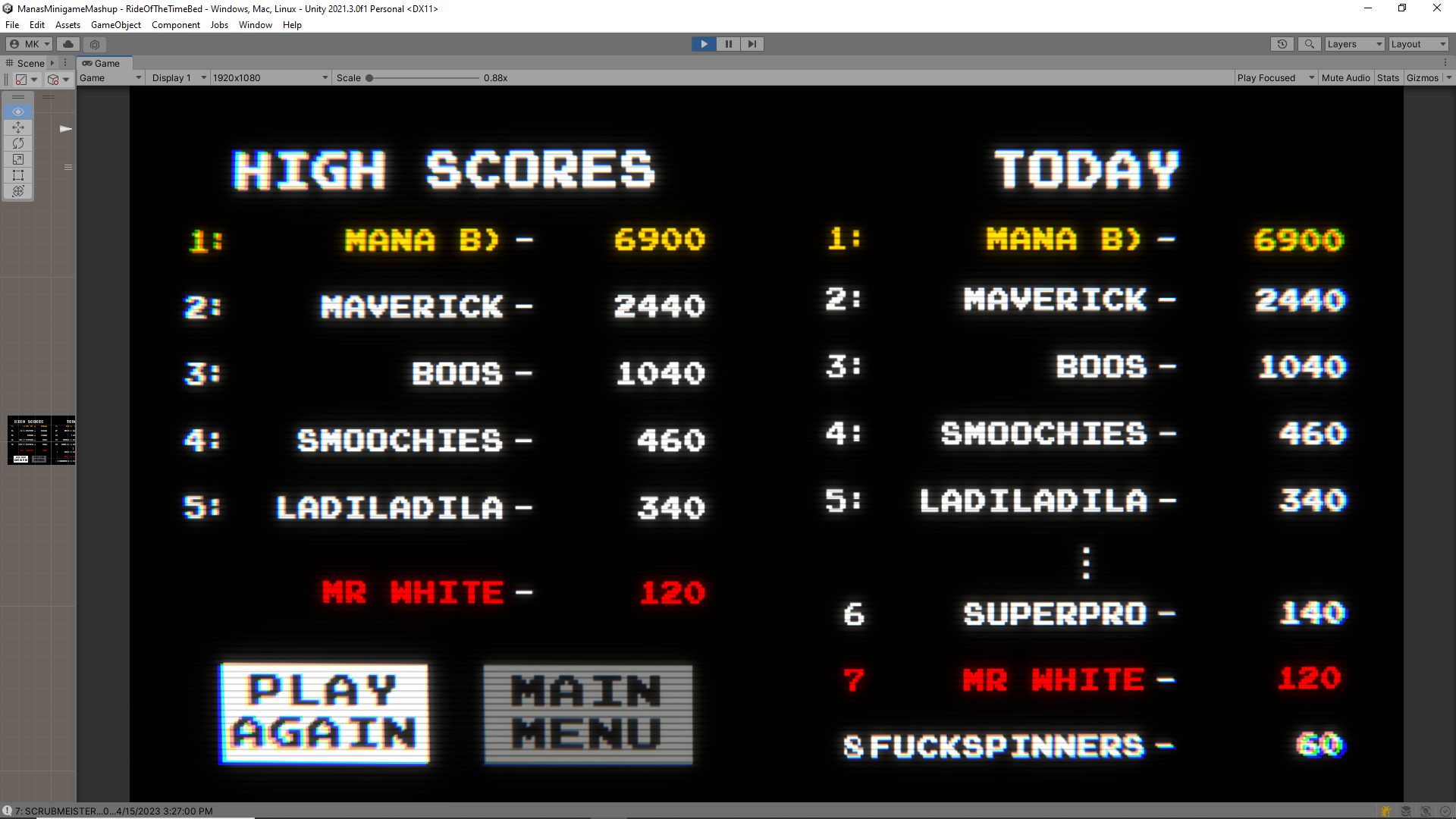
(Don't worry, I fixed the missing semi-colon in the today section. Also, it shows the score the player just achieved, plus the score above and below it. It just happens to be rank 7 in the screenshot)
I also now show the high score during gameplay, and both score counters turn gold when the player is beating the all-time high score! I'm considering making the word "high score" in the top bar blink as well when that's happening, but that's a possible future polish. Of course, once the Arcade and menu of the game are implemented, you can also see the high scores there, and they will probably be displayed in Attract Mode.
Audio
For audio, I reused the laser and impact noises from the first game, and replaced everything else with sounds from this Unity Asset. Nothing really special there.
As for music, the original was good, but it didn't really fit with the more old-school look of the current game in my opinion. So I sniffed around my usual source, Kevin MacLeod's Incompetech. While I was doing this, my friend Michael joined the Discord call I was in. Michael makes music sometimes, and when I told them that I was struggling to find something 8-bit/chiptune style that fit the vibe of my game, they went "holdon, I know a retro music program". A surprisingly short amount of time later, the current music was composed and implemented in the game! Thank you Michael <3.
Concluding thoughts, and What's Next
Whew, this has become a loooooong post 😅. I think my biggest concluding thought might be that I should make these devlogs in smaller portions. Oops.
Honestly, concluding thoughts are still a little hard at this point. Everything is untested so far, so a lot of the things I've been stating here are uncertain. It is very very possible that the game, in its current state, is too difficult for someone new to it. We will have to see. Expect a post with playtest conclusions at some point in the near future.
So, what's next then? Well, playtesting, of course. After that, if there's any egregious bugs or problems, we fix those, and we'll probably polish the difficulty of the game a bit. Then I'll probably spend a small amount of time adding more waves of enemies and bosses, and then hand those out for playtesting, but leave polishing it for the end of the project. The Arcade, or at least a blockout/first version of it, is next, and then we'll look at the other games! Hopefully expect updates in the near-future, and thank you for reading!
Sources of Inspiration
The controls of the game are pretty much The Binding of Isaac: Rebirth. Probably not the first game to use left-stick/WASD movement and right-stick/arrow keys shooting, but it's the one I know.
For the game-flow and waves of enemies, I took a lot of inspiration from a little gem called Devil Daggers, especially looking at the way that game introduces new enemies, and its flow between moments of panic, moments of satisfaction, and short moments of rest.
UI-wise, I probably had Ms Pac-man in mind while making it, but it's mostly just old arcade games (or what I imagine when I think of old arcade games, those are unfortunately a little before my time and I have played shamefully few)
Files
Get Mana's Magical Minigame Mashup Machines
Mana's Magical Minigame Mashup Machines
A game pack of arcade games
| Status | Released |
| Author | Mana Kouwenberg |
| Genre | Racing, Sports |
| Tags | Arcade, Bullet Hell, game-pack, High Score, minigames, Retro, Singleplayer |
| Languages | English |
More posts
- Mana's Magical Minigame Mashup Machines is now released!Jun 11, 2023
- CreditsJun 03, 2023
- Devlog v0.31 - A boxApr 30, 2023
- Devlog v0.20Apr 20, 2023
- v0.20 ChangelogApr 18, 2023
- v0.13 Playtest ResultsApr 18, 2023
- DevLog IntroductionApr 16, 2023
Leave a comment
Log in with itch.io to leave a comment.